Landing pages that convert are where most small business marketing budgets quietly die. You can fix your targeting, rewrite your ads and lower your cost per click, and none of it matters if the page people arrive at asks them to work too hard. The click is the expensive part. Wasting it is the expensive mistake.
This guide covers what actually changes conversion rates for a local business, what is merely cosmetic, and the handful of fixes that produce the largest gains for the least effort. As the Best AI Digital Marketing Freelancer in Chennai, page structure is the first thing I look at when ads are running and enquiries are not arriving.
Why Sending Traffic to Your Homepage Loses Money
This is the most common error and the easiest to fix. Someone searches for one specific thing, clicks an ad promising that thing, and lands on a homepage offering eleven things. They now have to find their way to what they wanted, and a meaningful share will not bother.
Your homepage is a menu. It exists to orient someone who does not yet know what they need. A person arriving from a specific search already knows. Showing them a menu answers a question they did not ask, and every additional choice sheds a percentage of visitors.
The rule that fixes it
One page, one job, one audience. If you advertise three services you need three pages, each continuing the conversation its ad started. That sounds like more work than it is, because the pages share a skeleton and differ only in specifics.
If three pages is genuinely not possible now, point each ad at the closest existing service page rather than the homepage. Not ideal, still a large improvement. The paid side of this is covered in the Google Ads setup guide.
The Anatomy of a Page That Converts
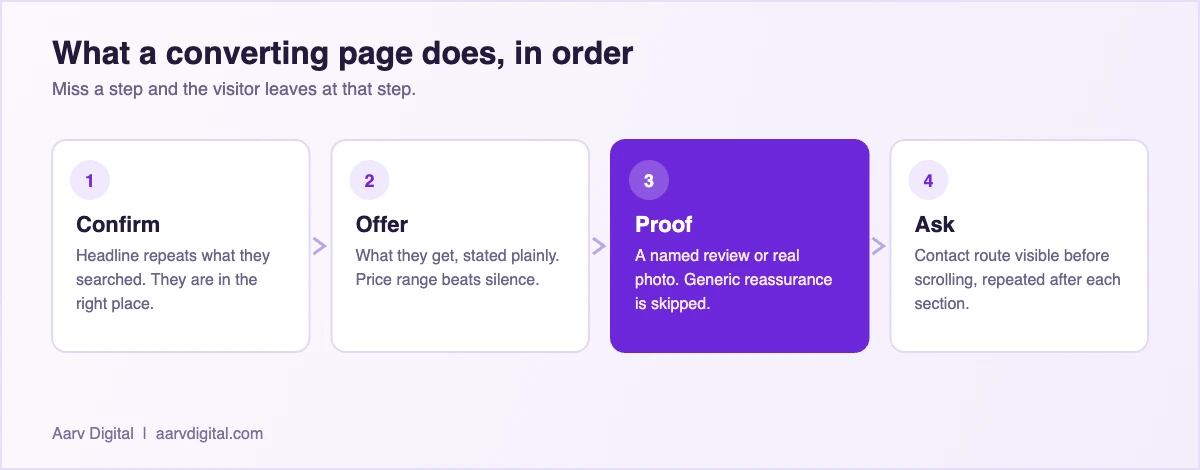
Strip away the design debate and a converting page does four things in order. It confirms the visitor is in the right place, says what they get, gives a reason to believe it, and makes the next step obvious.
Traffic that arrives without paying for it deserves the same treatment. The groundwork for that is in the guide to AI-powered local SEO for Chennai businesses.
The headline confirms, it does not impress
The visitor decides within a couple of seconds whether this page is about their problem. A headline repeating their search back to them wins. “Emergency AC Repair in Velachery, Same Day” beats “Excellence in Climate Solutions”, because the first answers the question they arrived with.
Proof has to be specific to be believed
“Trusted by hundreds of happy customers” is invisible because every page says it. A named review with a real detail, a photograph of actual work, an oddly precise number, these get read. Generic reassurance is skipped entirely, so the space it occupies is wasted.
The ask appears before they scroll
The contact route needs to be visible without scrolling on a phone, then repeated after each major section. Not because people missed it, but because readiness arrives at different points. Someone convinced by your price list should not have to hunt for the button.
Remove everything else
Navigation menus, unrelated offers, social icons, blog links. Each one is an exit. A page receiving paid traffic should have almost no way out except the action you want. This feels wrong to people used to building websites, and it is consistently what works.
The Mobile Reality
For most Chennai local businesses the large majority of ad traffic arrives on a phone, often on mobile data, often while the person is doing something else. Designing on a desktop monitor and checking mobile afterwards produces pages that technically work and practically fail.
What to check on an actual phone, not a simulator
- Is the offer clear without scrolling? If the first screen is a large image and a logo, the page wasted its best moment.
- Can you tap the contact button one handed, with a thumb, without zooming.
- Does it load on a weak connection? Test on mobile data, not office wifi.
- Is the phone number tappable, so it dials rather than needing to be copied.
- Is WhatsApp offered? For a large share of customers this is the preferred route and its absence costs enquiries.
Quick Tip: Open your landing page on your phone, hand it to someone who does not know your business, and ask them what you sell and what happens next. Watch where they hesitate. Ten minutes of that beats any amount of theory, and the hesitation point is almost always the thing to fix first.
Forms: The Silent Killer
Every field you add costs you submissions. That is close to a law, and small businesses routinely ask for information they do not need at the point of enquiry.
Name and one contact method is usually enough to start a conversation. Company name, budget range, how they heard about you, preferred callback time, all of these can be asked later by a human who has already established interest. Asking upfront trades enquiries for convenience, and enquiries are worth more.
The second error is a form that punishes mistakes. Validation clearing the whole form, errors appearing only after submitting, a captcha failing twice. Each loses people who genuinely wanted to contact you, the most expensive kind of loss there is.
Offer a route that is not a form
Some people will never fill a form and will happily send a WhatsApp message. Offering both costs nothing and captures a group you were losing entirely. Handling that channel well is covered in the WhatsApp marketing guide.
Speed Is a Conversion Feature
Page speed is treated as a technical concern and it is a commercial one. On mobile data, a page taking several seconds to become useful loses visitors before they have seen anything you wrote. You paid for that click.
If you are choosing tools to build or test pages, the shortlist of AI tools for local business is a more useful starting point than a long directory.
The usual culprits are predictable: enormous uncompressed images, a page builder loading fonts and scripts it does not need, and video embedded above the fold. Compressing images to a modern format is usually the single biggest win and takes an afternoon. Everything else is a distant second.
The test that matters is not a score out of a hundred. It is whether the page shows something useful quickly on a mid-range phone. Chase that, not the number.
| Change | Effort | Typical impact |
|---|---|---|
| Send ads to a matching page, not the homepage | Medium | Large. The most common fix and usually the biggest. |
| Cut the form to two fields | Low | Large. Every extra field costs submissions. |
| Add a WhatsApp option beside the form | Low | Large in this market. Captures people who never fill forms. |
| Put a price or a range on the page | Low | Medium to large. Silence makes people assume the worst. |
| Compress images to a modern format | Low | Medium on mobile data, where most of your traffic is. |
| Change button colour or font | Low | None you will ever be able to measure at this volume. |
What to Test and What to Leave Alone
Small businesses rarely have the traffic for proper testing, which makes discipline about what to change more important, not less.
Worth changing
The headline, the offer itself, what the form asks for, and where the contact button sits. These produce differences large enough to notice without statistical rigour, because they change what the page is rather than how it looks.
Not worth your time
Button colours, font choices, minor wording tweaks, and anything from a case study about a business unlike yours. At small volumes you cannot distinguish these from noise, and the hours are better spent on the offer. For judging any of it against revenue, see the guide to measuring marketing ROI.
A Page Structure You Can Copy
If you want a starting skeleton rather than principles, this order works for most local service businesses and can be built in an afternoon.
- Headline naming the service and the area, matching the ad.
- One sentence saying who it is for and what happens next.
- Contact button and phone number, visible without scrolling.
- Three bullets covering the objections you hear most: price, timing, trust.
- Proof: two real reviews with names, or photographs of actual work.
- Price guidance, even a range. Pages that dodge price lose people who assume the worst.
- A short form, two fields, next to a WhatsApp option.
- Repeat the contact route at the bottom for anyone who read everything.
Nothing here is clever. It is a page that answers the questions a customer would ask in the order they would ask them, which is most of what conversion optimisation amounts to at this scale.
Matching the Page to the Ad
The gap between what an ad promises and what the page delivers is called message match, and it is the most under-appreciated lever in small business advertising. When the two line up, conversion rises without you changing anything else. When they do not, visitors experience a small moment of doubt, and doubt is expensive.
Repeat the words, not just the meaning
If the ad says “same day AC repair”, the page headline should contain those words rather than a paraphrase. This feels repetitive when you read the two side by side, and that is fine, because no customer ever does. They see one then the other, seconds apart, and the repetition reads as confirmation rather than laziness.
Match the offer exactly
An ad mentioning a free inspection must land on a page where the free inspection is visible immediately. If the offer is buried, or worse, absent because it was only ever an ad headline, you have taught the visitor not to trust the page. That damage carries into everything else on it.
Match the audience too
A campaign targeting one neighbourhood should land on a page naming that neighbourhood. A campaign for commercial clients should not land on a page written for households. Running one page for several campaigns is the compromise most small businesses make, and it is worth knowing what it costs you rather than assuming it is free.
Common Mistakes That Cost Enquiries
Five patterns account for most of the lost conversions I see on small business pages, and none of them require a designer to fix.
The first is hiding the price entirely. Businesses avoid it fearing they will scare people off, and the effect is the opposite: visitors assume the worst and leave without asking. A range with an honest explanation of what moves it converts better than silence almost every time.
The second is a hero image that says nothing. A large stock photograph of a smiling stranger occupies the most valuable space on the page and communicates nothing. Either show your actual work, or use that space for the offer.
The third is burying the contact route below a long scroll on mobile, which loses everyone who was ready early. The fourth is asking for too much information before you have earned it. The fifth, and the most quietly damaging, is a page that has not been opened on a phone by anyone at the business in months.
None of these need a redesign. They need an afternoon, a phone, and a willingness to look at the page the way a stranger does.
How Often to Revisit a Page That Is Working
A landing page is not a project you finish. Prices change, the objections customers raise shift, and a page written for last year quietly stops matching the conversation you are actually having on the phone.
A sensible rhythm for a small business is a proper look every quarter and a quick check monthly. The monthly check is two minutes: open it on a phone, confirm nothing has broken, confirm the price still reflects reality. The quarterly look is longer and asks a better question, which is whether the objections listed on the page are still the ones customers are actually raising.
That last question is the valuable one, and the answer lives in your own enquiries rather than in any analytics tool. If three people this month asked something the page does not address, the page has a gap. Add it, and the page improves without a redesign, a test, or a single line of new code.
Frequently Asked Questions
How many landing pages does a small business need?
One per service you actively advertise, no more. Three well-maintained pages beat a dozen neglected ones. If a page is not receiving deliberate traffic from a campaign, it does not need to exist separately.
For a page receiving paid traffic, no. The menu is an exit and the point is keeping the visitor on the decision you brought them there to make. For an organic service page people browse to, keep it, since the context is different.
How long should the page be?
Long enough to answer the objections that stop people buying, and no longer. A simple urgent service needs very little. An expensive considered purchase needs proof, pricing detail and reassurance. Length follows the size of the decision, not a rule.
Do I need a separate tool to build landing pages?
Usually not. Most small businesses can build what they need in the site they already have. A dedicated tool adds a subscription and a second place to maintain things, rarely worth it below a steady volume of campaigns.
What conversion rate should I expect?
It varies far too much by industry, price point and traffic quality for a benchmark to help. The number that matters is your own last month. If this month is better, the change worked. Comparing yourself to a published average from another market is a good way to reach the wrong conclusion.
Can AI write my landing page?
It can draft it, and the draft will be structurally sound and generically worded. What it cannot supply is the specific proof, the real prices, the actual objections your customers raise and the local detail that makes a page believable. Use it for the skeleton, supply the substance yourself.
Fix the Page Before You Raise the Budget
If ads are running and enquiries are not arriving, the instinct is to increase spend or change targeting. Look at the page first. It is cheaper to fix, it improves every channel at once rather than only the one you are adjusting, and in most small business accounts it is where the actual problem lives.
If you are a local business owner or startup founder in Chennai looking to grow faster with smarter marketing, let’s talk. As the Best AI Digital Marketing Freelancer in Chennai, Arvind at Aarv Digital helps small businesses use AI to get more customers, save time, and scale sustainably.
Contact Arvind at Aarv Digital today to start your digital marketing growth journey, visit aarvdigital.com or reach out directly to book a free consultation.

Written by
Arvind Kumar
Founder of Aarv Digital, based in Chennai. Arvind helps local businesses and startup founders use AI to win more customers without adding headcount. New guide every three days.
Keep reading